From the Chronicle of Philanthropy:
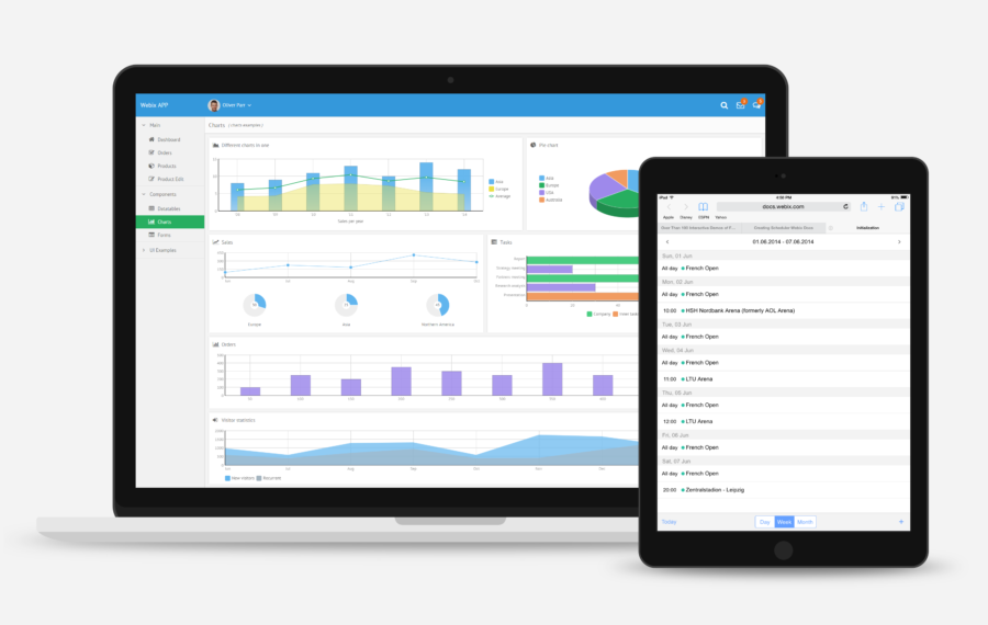
Starting today, gone are the static pie charts and other design elements that often served as preliminary snapshots for grant makers and others seeking information.
They have been replaced with interactive data visualizations that illustrate charities’ revenue and expenses over many years and others that show the demographic makeups of charities’ board members and staff. The number of tabs across the tops of the profiles has been reduced from more than a half dozen to four — summary, programs and results, financial data, and operations.
The new design is intended to allow users to more easily identify an organization’s geographic reach, results, sources of funding, financial stability, and leadership. The redesign also includes a shift in emphasis from charity overhead costs to programs and results, a reflection of a broader debate in the nonprofit world about measuring and communicating impact.
Click here to continue reading on the Chronicle of Philanthropy website.

